

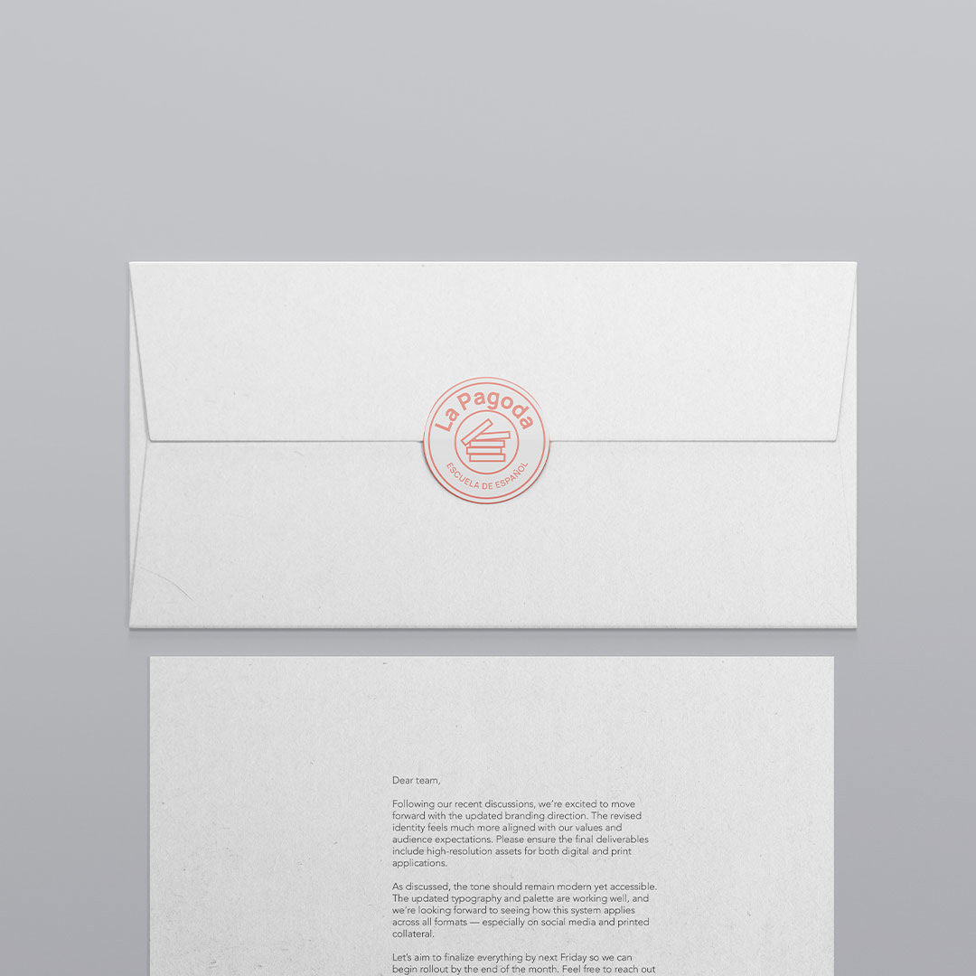
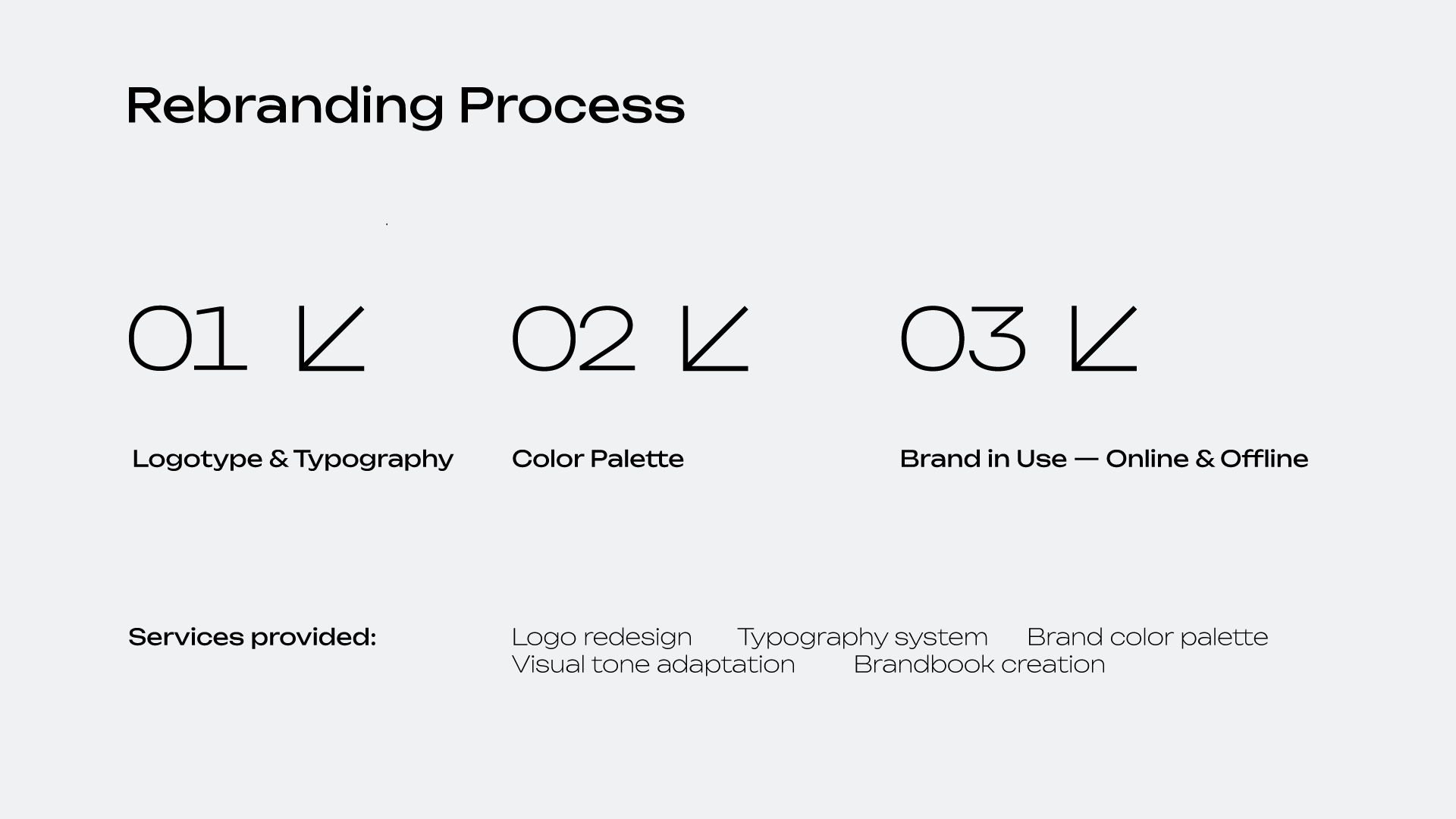

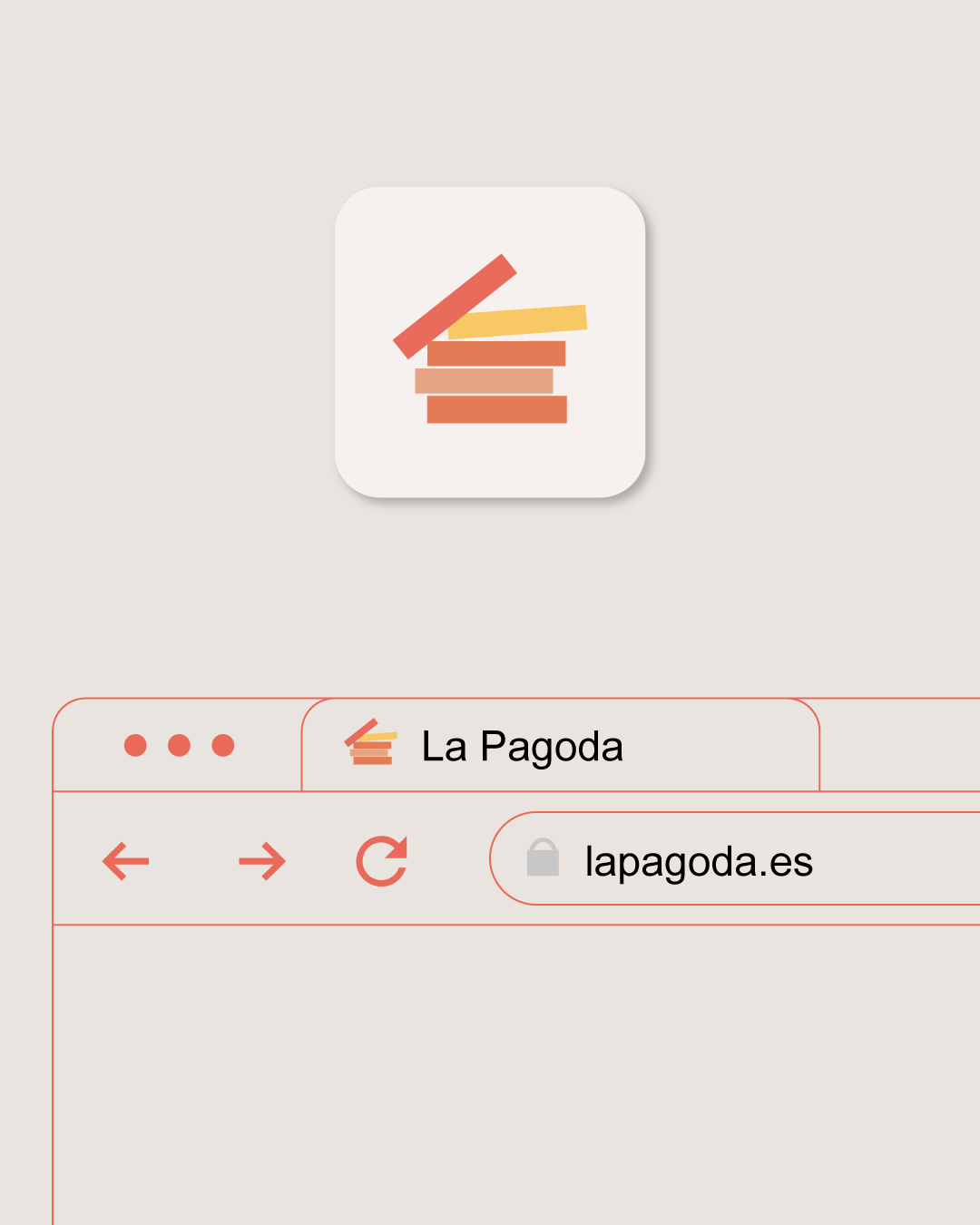
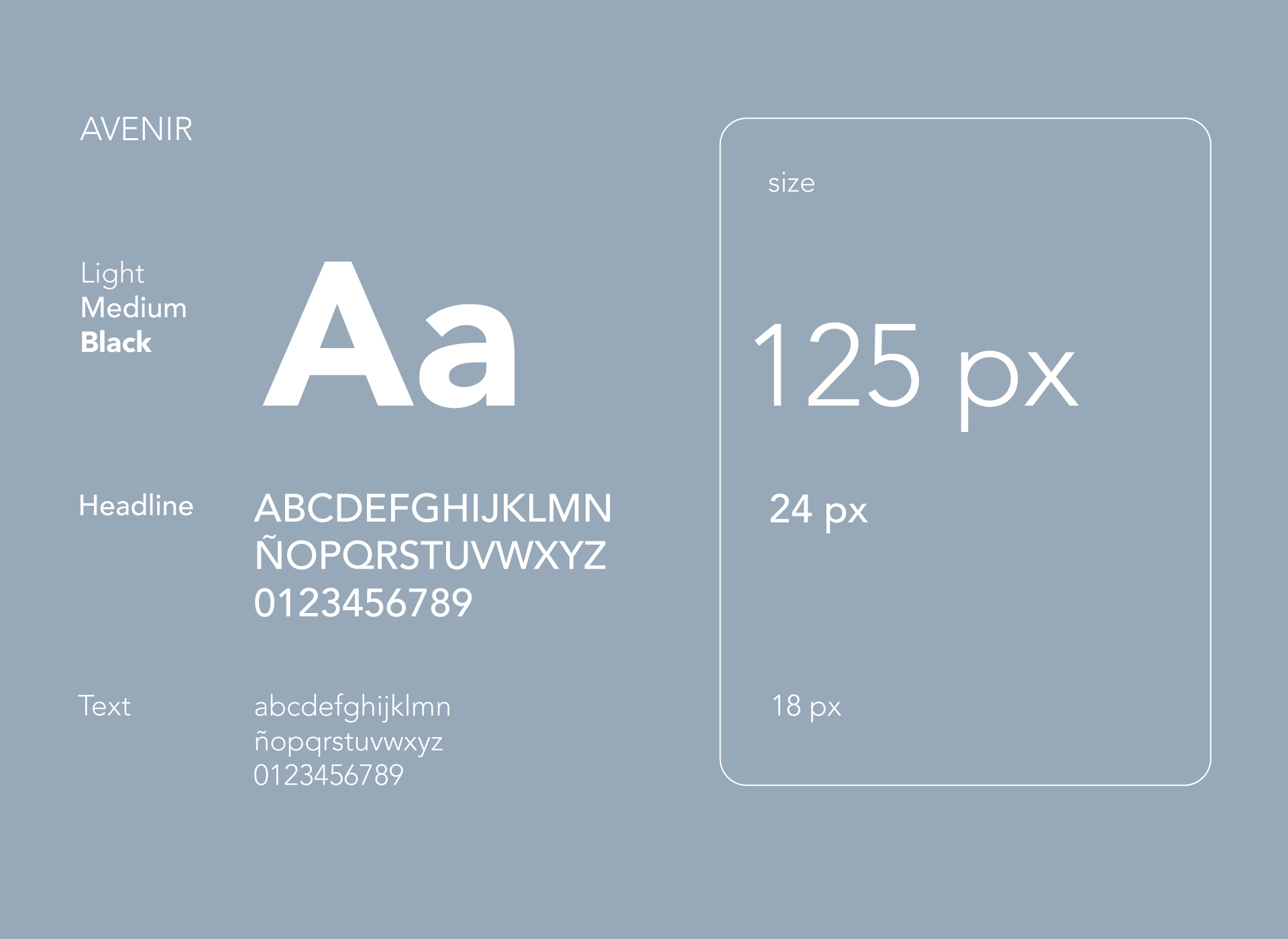
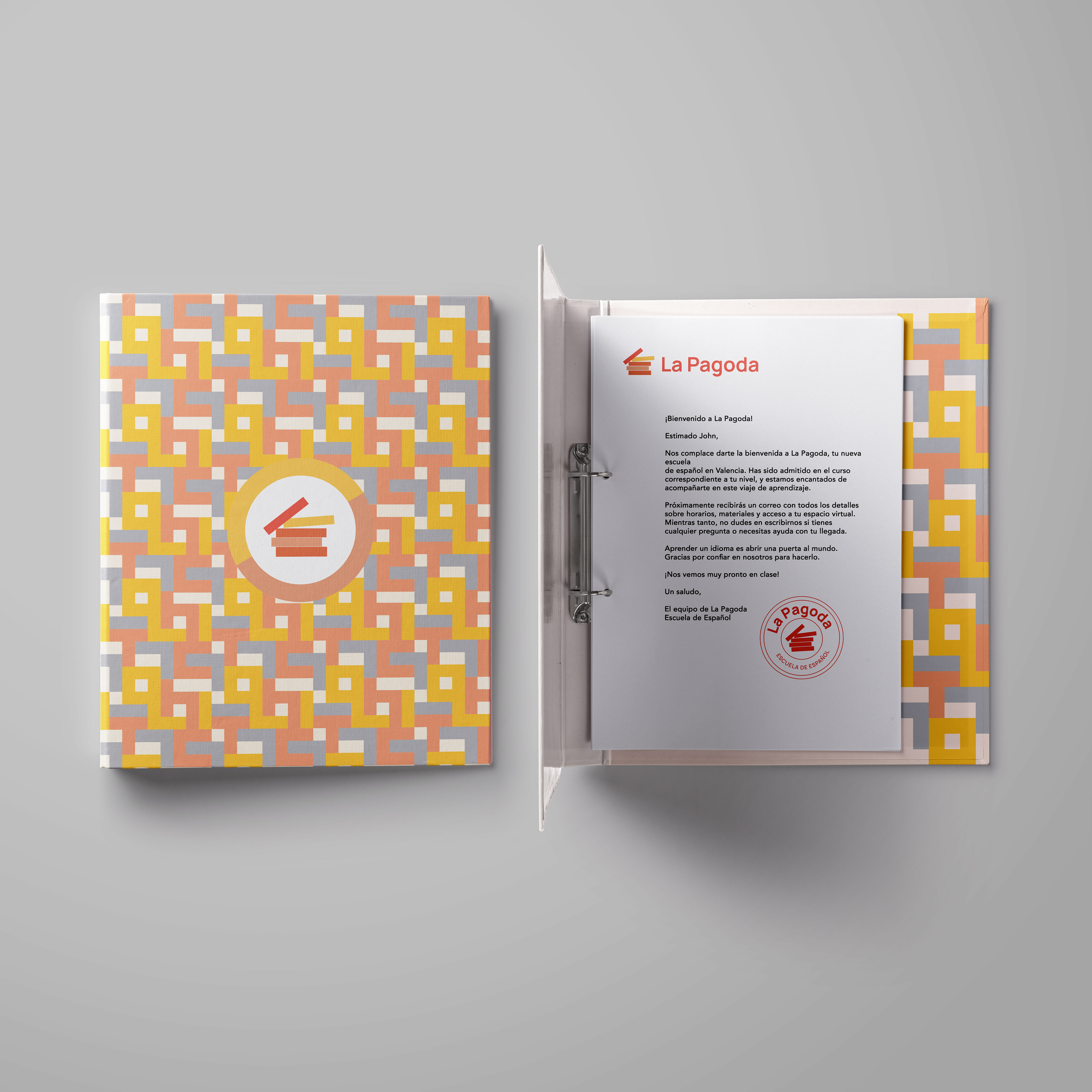
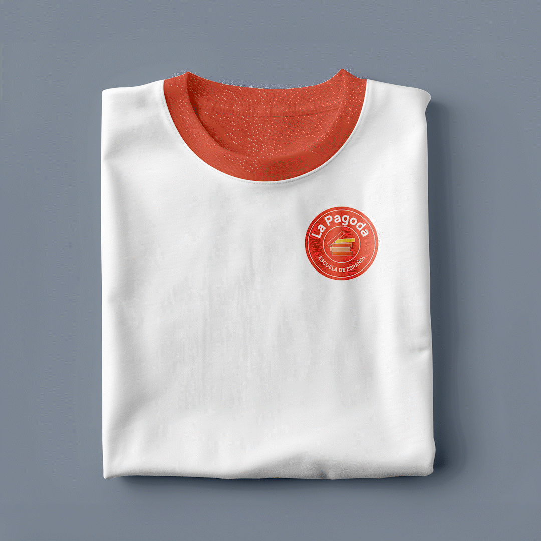
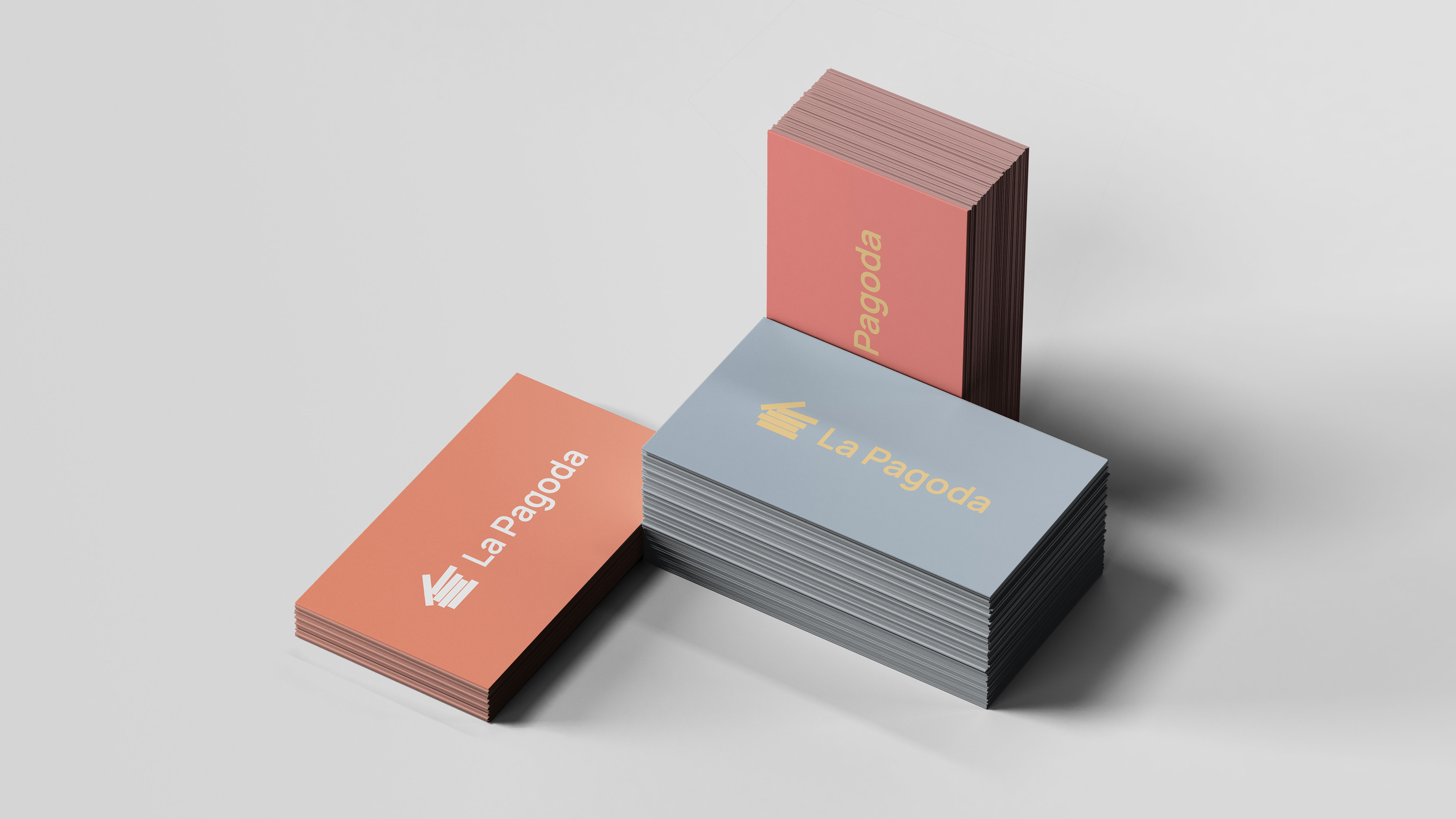
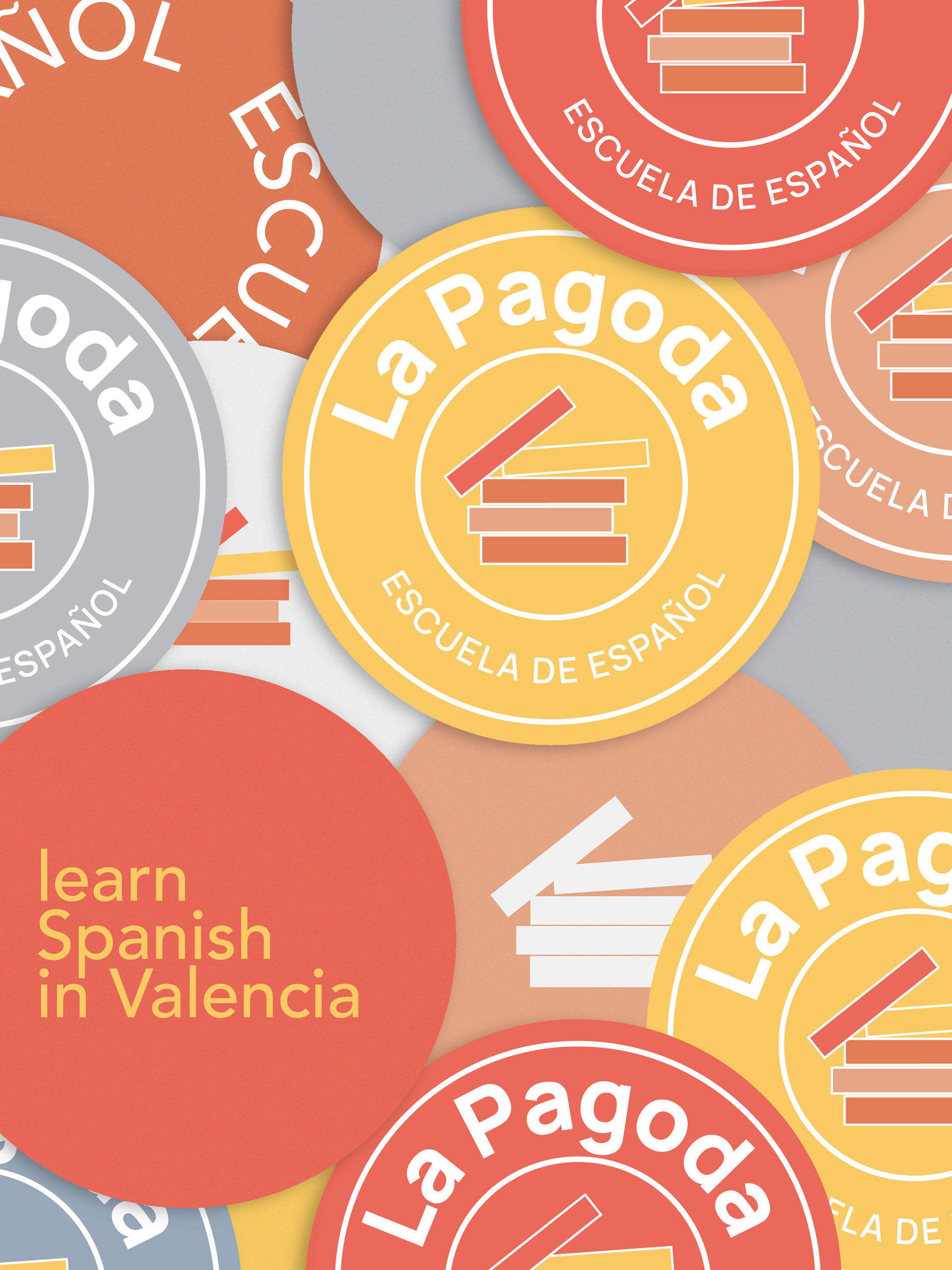
01. Logotype & Typography
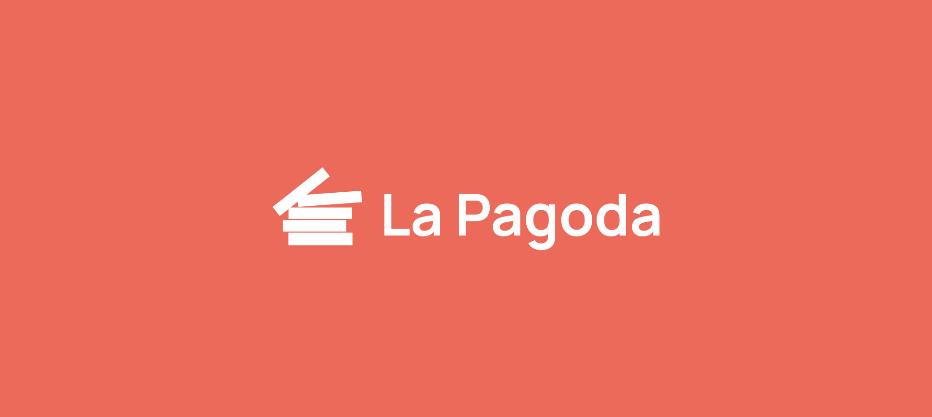
The rebranding was initiated in response to practical issues with the original logo. Its thin lettering caused poor legibility in print, especially at smaller sizes or on textured surfaces. To solve this, the typographic structure was reworked — the new version is bolder, more balanced, and optimized for both print and digital use.

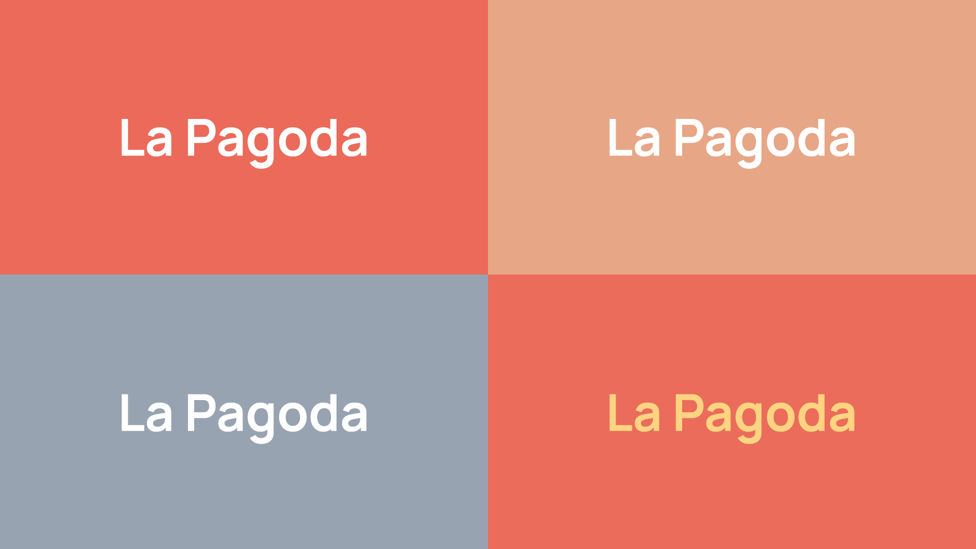
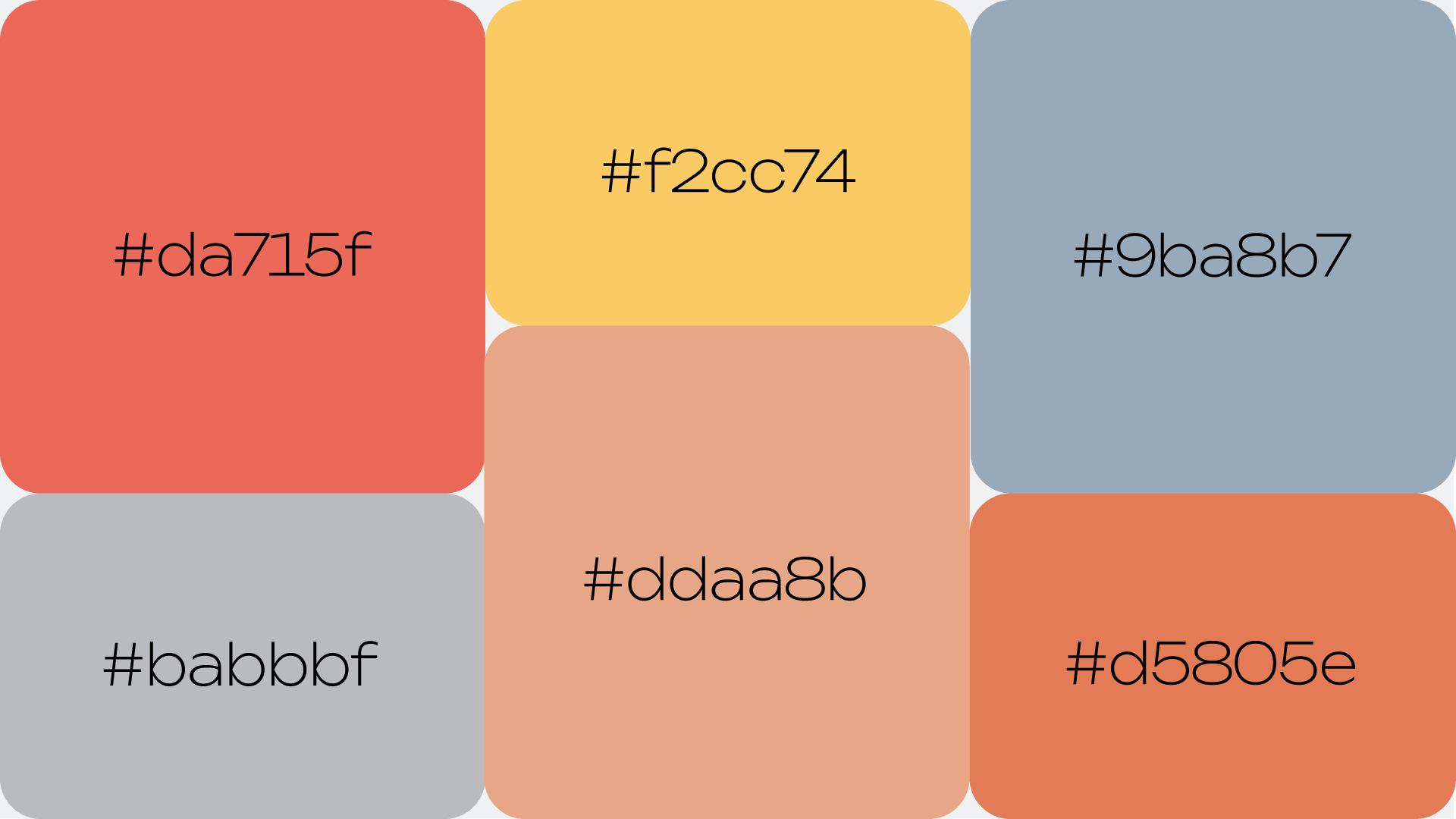
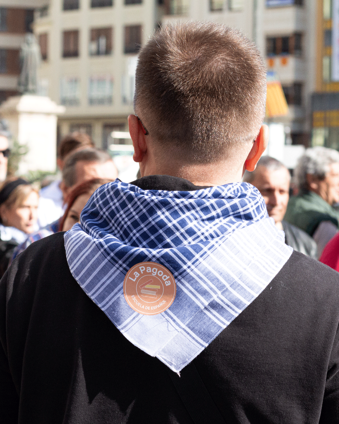
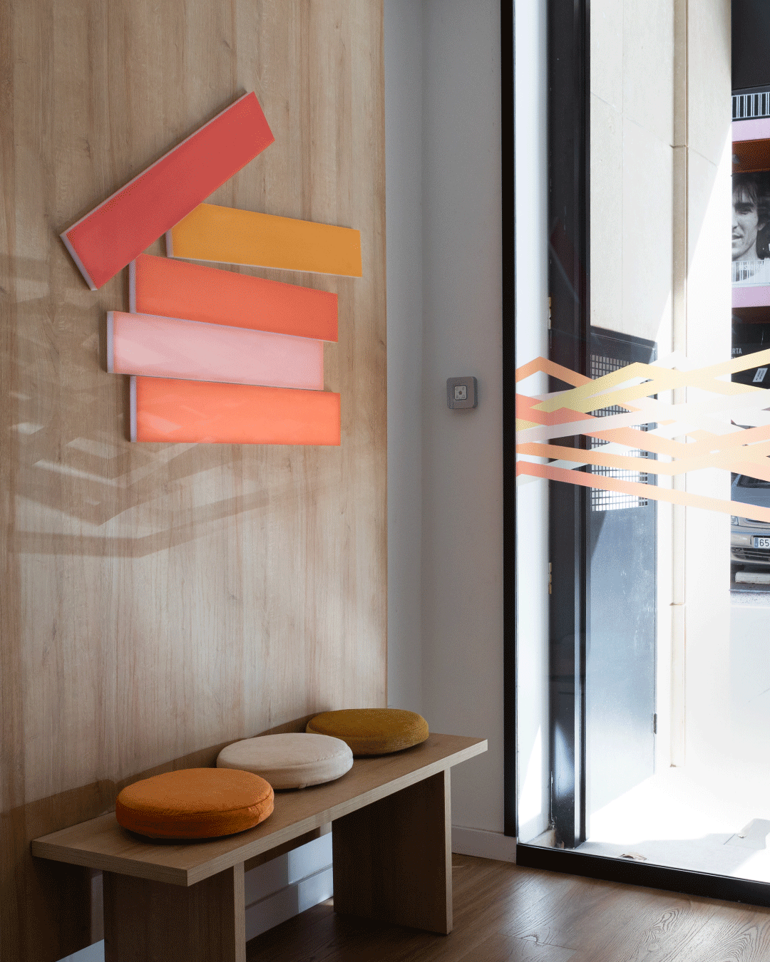
02. Color Palette
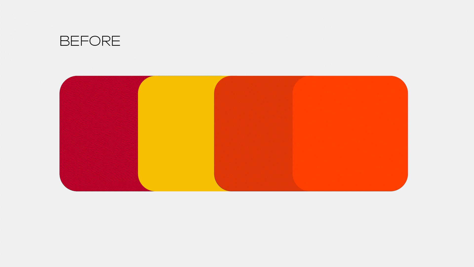
The original brand colors were overly saturated and visually aggressive. As part of the refresh, the palette was redesigned with softer, pastel tones that communicate warmth and professionalism.
To add dimension and contrast, two complementary shades of grey — one cool and one warm — were introduced. Together, the new palette supports clarity, calmness, and adaptability across various brand applications.
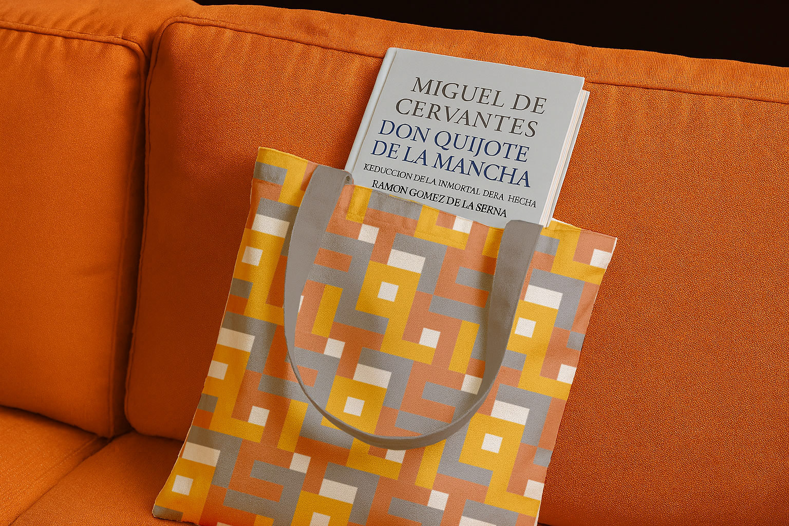
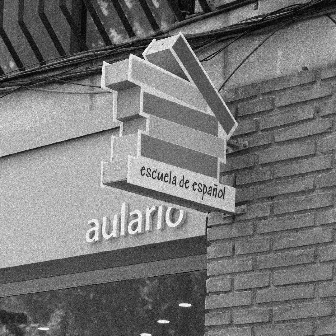
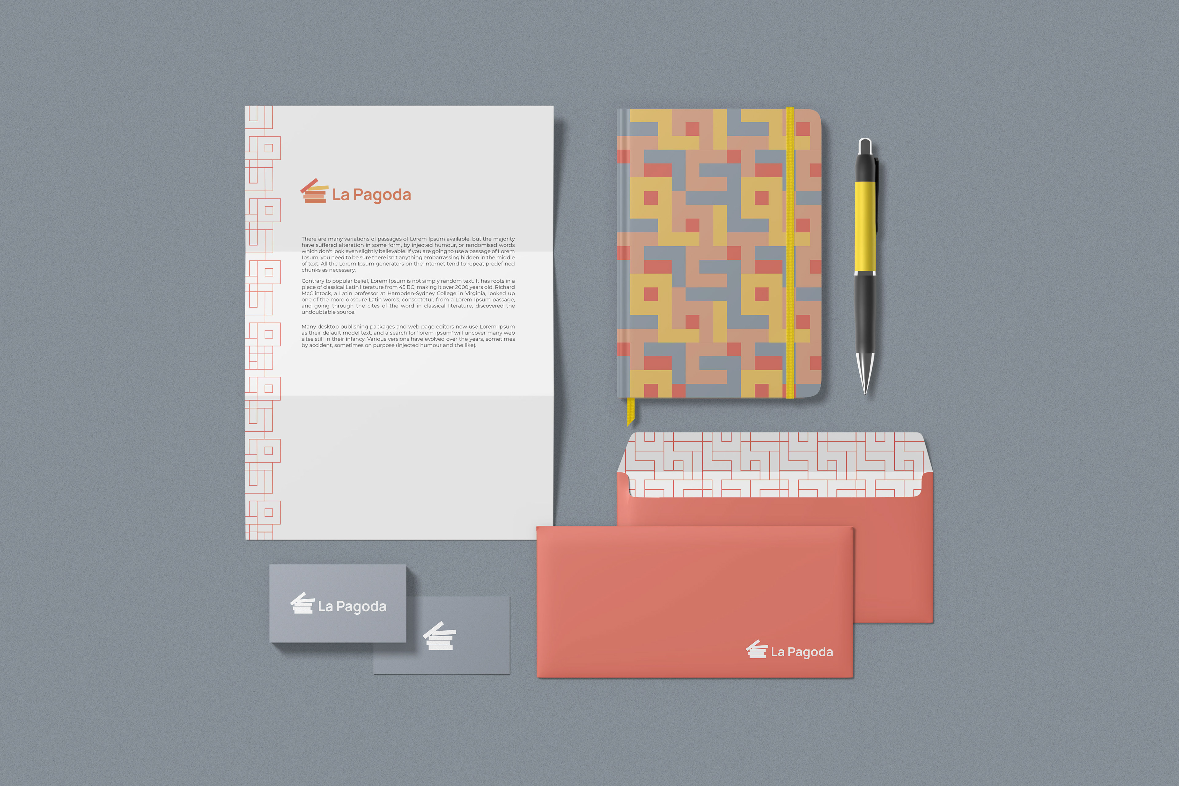
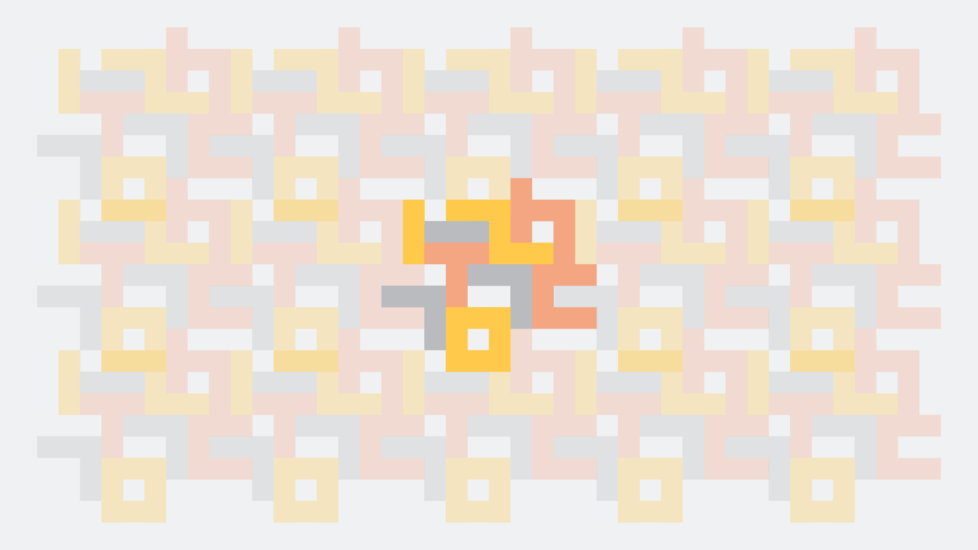
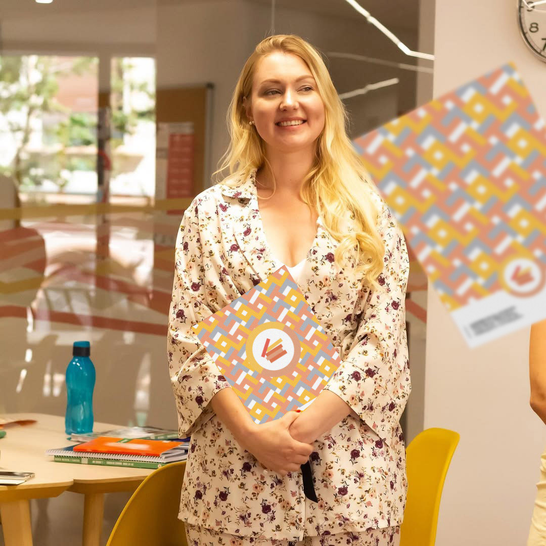
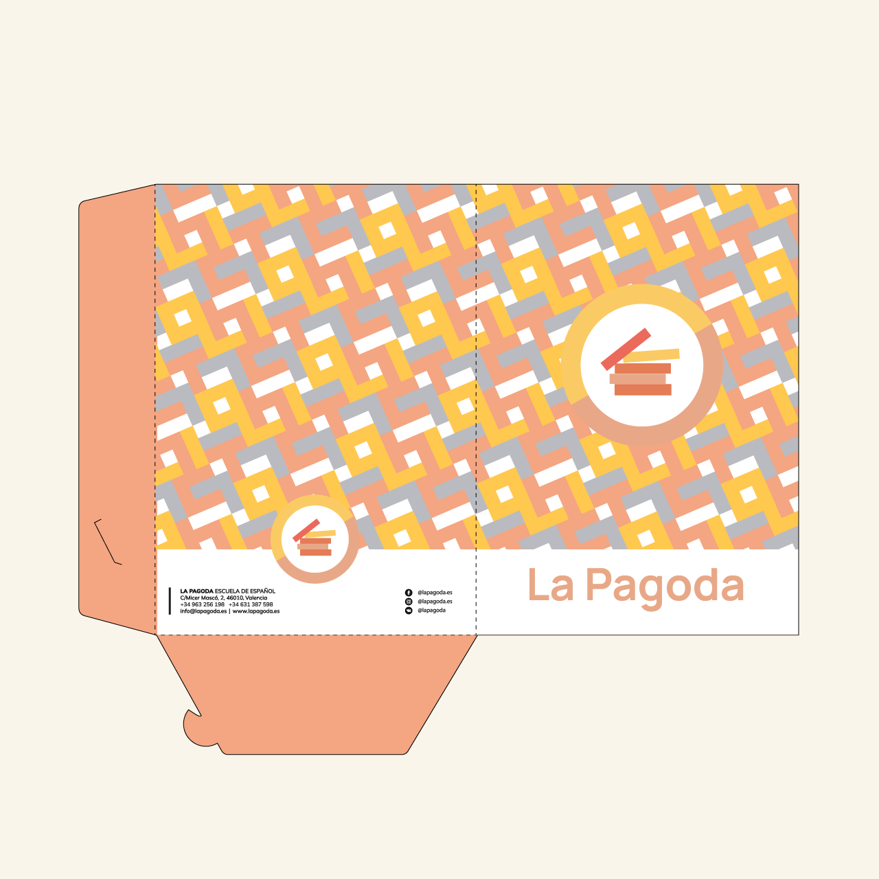
03. Brand Pattern
The pattern was built using custom-made letterforms, constructed from the same foundational blocks used in the original logotype. Each letter was intentionally created from modular elements to emphasize the core values of the brand — structure, clarity, and accessibility, all essential to a language education environment. By working within a strict grid system and repeating visual logic, the pattern reinforces the idea of learning through building blocks — much like how language is acquired step by step.


Creative Direction & Design: Nazrin Ah
Strategy & Visual Identity: Sand N' Wind Studio
Copywriting & Brand Voice: Nazrin Ah x La Pagoda
Client: La Pagoda – Spanish Language School
Launch: 2023
Strategy & Visual Identity: Sand N' Wind Studio
Copywriting & Brand Voice: Nazrin Ah x La Pagoda
Client: La Pagoda – Spanish Language School
Launch: 2023
Contact: studio@sandnwind.com